Review: DROP ALT – MARVEL Keyboard / Hands-On Look at the Custom Keyboard Market
Introduction
Techsponential is working on a guide for hybrid work (enterprise and SMB), including PC accessory recommendations. As part of the research process, I asked DROP to send over a custom keyboard configuration to see what options are available in switches and keyboard layouts, as well as to get a better view into a corner of this growing hobbyist niche.
DROP is a company that specializes in products targeting enthusiasts in mechanical keyboards and high fidelity personal audio gear. DROP often works with existing vendors to create group buys and customized variants of otherwise pricey devices, and it has its own products in some categories as well.
Most desktop keyboards that come with PCs -- especially enterprise PCs purchased in bulk -- are inexpensive rubber dome assemblies that have two key benefits: they’re incredibly cheap and actually fairly quiet. They also have numerous negatives: they feel horrible to use, they cannot be customized for purpose or design, and they aren’t terribly responsive. Mechanical keyboards have more sophisticated switch designs geared towards different purposes, and can be a great way to improve ergonomics and productivity. Other versions can be tuned for improved gaming performance. Customizing the look of the keyboard to match a décor theme or media property (like the Marvel theme used here) is also possible.
The main components to a custom mechanical keyboard are the keyboard base/circuitry, switches, and keycaps. Keyboards that support hot swappable switches don’t require soldering or any technical knowledge; provided you buy switch types that are supported by the keyboard in question, it’s a lot like snapping together LEGO. Similarly, switches have standard keycap mounts, and if you match them up correctly, a wide variety of compatible keycap options are available. There are also a truly endless array of further customization options. Numerous YouTube channels have sprung up to capitalize on the popularity of mechanical keyboards among gamers, writers, and programmers, inventing or repurposing language to describe the sound (“thoccy”) and feel (“scratchiness”) of different configurations.
Layout
I started by choosing a keyboard layout. There are a lot of options. Traditional 101 key keyboards are huge and have every key you might ever need, but smaller layouts preserve desk space and allow your mouse to be in a more ergonomic position nearer your body. TKL (“tenkeyless”) are essentially 101 key keyboards without the number pad, but they can still be fairly large. My Unicomp TKL has old-school IBM buckling spring switches that feel great, but the case itself has large bezels in all directions. It’s smaller than my full size Unicomp, but not small (both are also incredibly loud). Keyboards can get much more compact if you eliminate the function row and/or navigation keys. However, when I was testing extremely quiet Topre switches on Fujitsu’s keyboards (ideal for taking notes while on Zoom calls) I found that you really can go too far. The HHKB “60%” layout requires finger gymnastics to do any text editing at all, which kills my productivity.*
The 65% layout is a great compromise between extreme space saving and still having discrete navigation and delete keys. I don't typically use function keys, so that's no loss. I do miss having an "END" key, but can live with Function-à as a workaround. My workload does sometimes require a number pad; I have a standalone Microsoft compact number pad off to the side to use when needed.
Keyboard Base
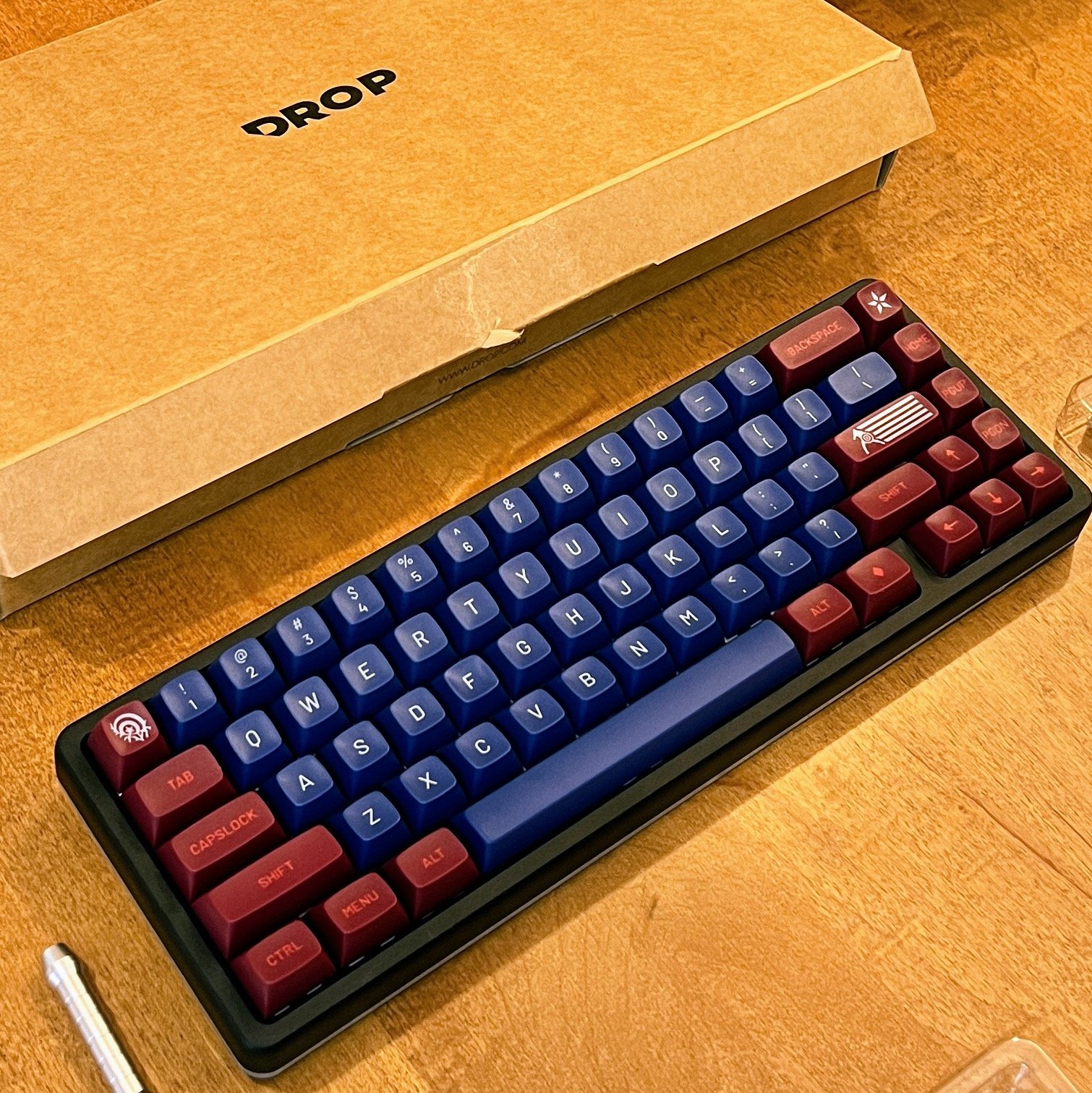
I chose DROP’s ALT High Profile keyboard in black CND aluminum. The “High Profile” means that the case comes up to the bottom of the keys; many custom keyboards have a bit of space between the keys and the keyboard. This appears to be mainly an aesthetic issue, and high profile keyboards look better to me.
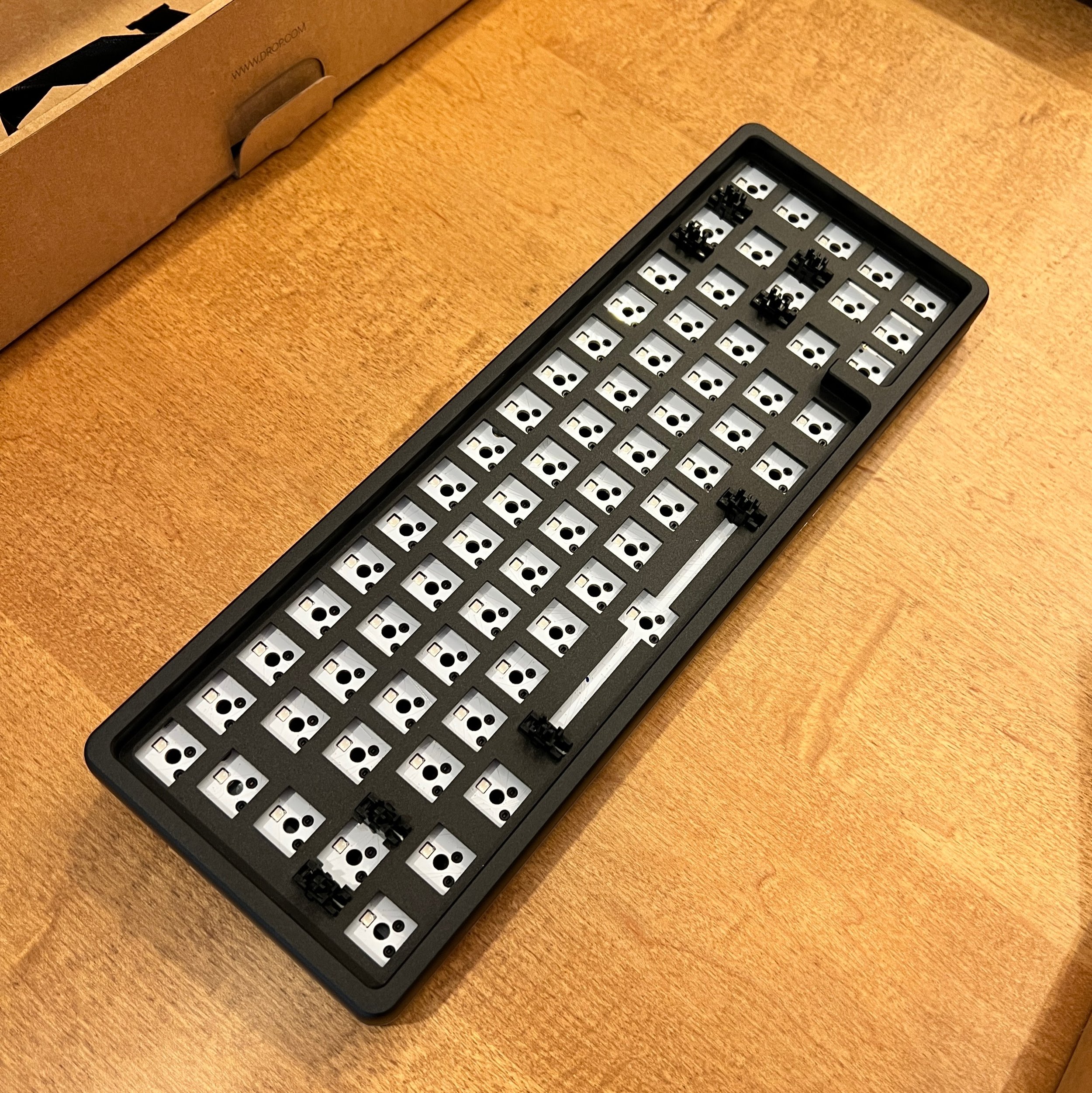
The DROP ALT may be made out of aluminum, but DROP clearly inserts some sort of steel plate insert (or possibly a cinder block) to make the unit an absolute beast. It is heavy, weighing over 2 lbs. It has no flex. It is going nowhere without your specific intent to move it. It has a slight angle (6%) but no adjustability. There are a pair of USB-C ports and a relatively cheap USB cable included. The keyboard base costs $140 by itself, or DROP sells it fully assembled with doubleshot PBT shine-through keycaps and a choice of six different switches for $199. The fully assembled version is a much better value (switches and keycaps each sell separately for more than $60 and require your own labor to put them all together), but where’s the fun in that?
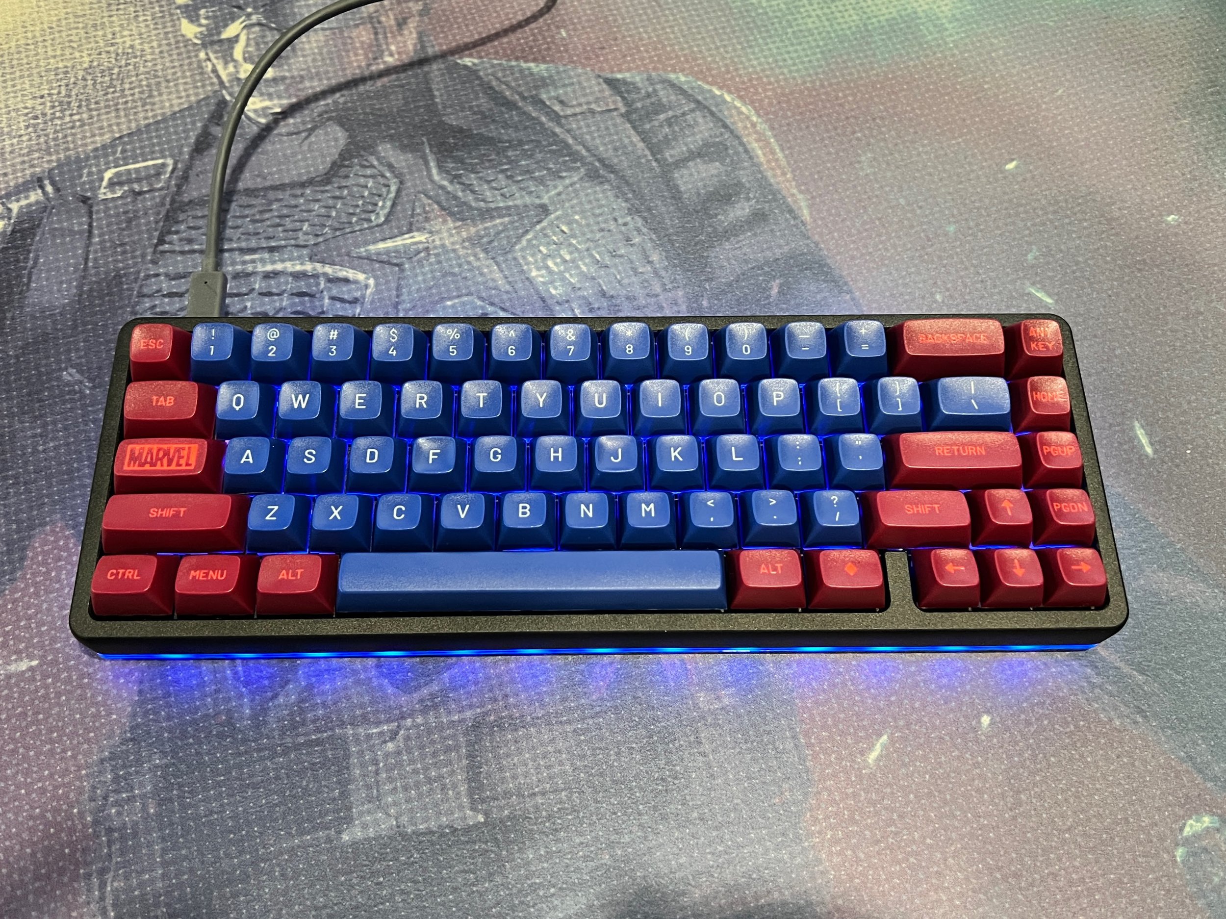
The DROP ALT keyboard shell has full color RGB lighting .... There's a nice ring of lighting around the full circumference of the keyboard and there's per-key individual lighting, but that light only shines around the keys, not through the thick keycaps unless you specifically get keycaps designed to let the light shine through. For now, I’m keeping the keyboard’s ring light and key area light in a shade of blue that compliments the keycaps (see below). At some point I’m sure I’ll switch to white, and eventually just turn it off altogether.
Switches
The choice of mechanical switch type is both purposeful – linear switches are better for fast button presses in gaming, tactile and clicky switches are best for typing response – and intensely personal. Switches can have different weights as well – how much effort is required to press the key. Heavier activation can make typing more deliberate, but some people find it physically exhausting over long typing sessions.
My main use case is typing, not gaming, and my favorite switches tend to be extremely tactile, with a clearly delineated point in the keystroke where you can feel that the key has been activated before it bottoms out. In buckling spring switches from IBM’s original PC keyboard, the tactile and auditory event are one and the same: when you press down, the spring literally buckles inside the switch, which acts as both the activation point, tactile event that you feel, and auditory “click.” You can still buy this type of switch in keyboards from Unicomp, but they aren’t designed for hot-swappable enthusiast keyboards. In more recent switch designs, the activation point and the “click” are actually separate parts of the switch. Clicky switches are tactile switches with an additional piece of metal that creates a “click” sound in addition to the sound the key makes when it strikes the chassis. Many people find the click satisfying, but, as you might imagine, if you want a quieter typing experience, avoid clicky switches.
For this project I chose DROP + INVYR Holy Panda switches, which were all the rage in the enthusiast community a few years back. This is a Frankenswitch – a tactile switch that combines the stem (center portion) from Halo Clear and puts it the outer housing of Invyr Panda switches and 67g weighted springs. This combination is supposed to provide the best combination of tactility and smooth operation with minimal key wobble and a pleasingly bass-y sound.
I can confirm that these switches are pleasing to type on, though the spring weighting feels lighter to me than it is rated, and these are far from the most tactile switches I’ve ever used. On two occasions I found my resting middle finger was actually activating the “d” key, nearly leading to a tweet about MediaTek with a long string of “dddddddddddddddddddddd” in the middle. They do sound nice, though – they’re more muted than clicky switches and the sound is lower in frequency, which sounds less grating.
Keycaps
One of the unique contributions from DROP to the custom keyboard market are MT3 profile keycaps in a specific, rising curved shape reminiscent of IBM beamspring terminals from the 1970’s. The middle row is flat, but the rows above and below are angled, and the keys themselves are crater-shaped so that your fingers rest in them naturally. It may not be ideal for gaming, and I suspect that people who grew up with flat laptop keyboards may require some time to acclimate. However, it is an incredibly comfy arrangement for typing and I cannot recommend MT3 highly enough.
DROP has multiple MT3 profile keycap sets to choose from, including versions that look like legends from IBM terminals from the 1970’s and Apple II’s from the 1980’s. For the less practically minded, DROP also has a licensing agreement with Disney for different Marvel superheroes with color schemes and custom keycap artwork. I determined that the Captain America set looked like the best combination of social media friendly and useable, so I chose that. DROP also sent over a Captain America deskmat that is far too large for my actual desk setup, but looks absolutely stellar in photos. This is a review unit. Gotta make sure it looks pretty!
DROP uses thick plastic (“doubleshot ABS”) for its keycaps. They feel terrific and should wear well over time without the key labels rubbing off.
Assembly
The assembly process was mostly straightforward and required no specific expertise. This is a simpler project than building a desk from IKEA and much simpler than building your own PC. There are certainly ways to build and modify keyboards that require soldering irons, lubrication, and tools, but this was simple: snap switches into a pre-built keyboard case, and then press keycaps on top. The entire process took less than an hour, including time for troubleshooting.
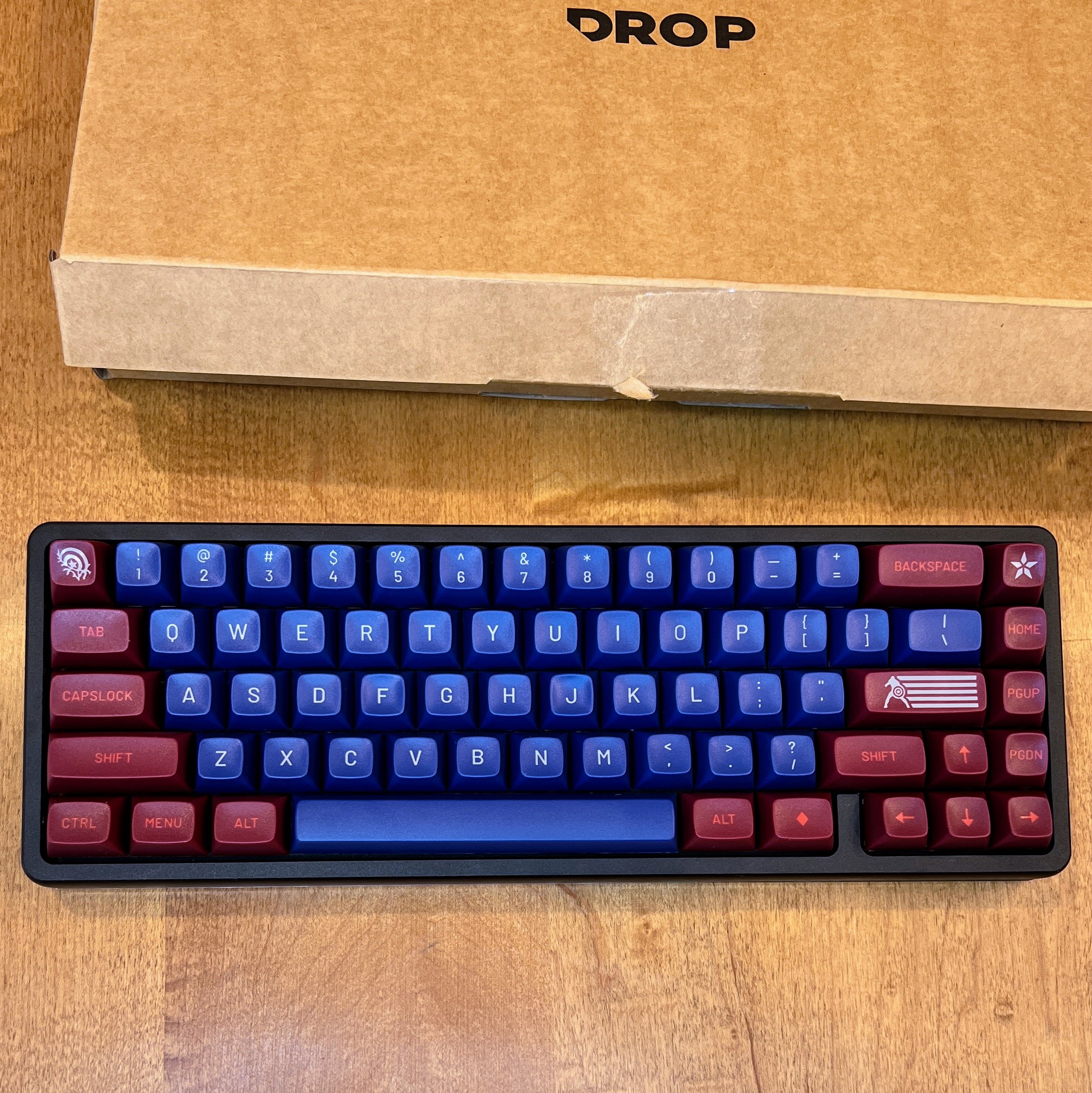
There is an area where DROP needs to add more help, both pre-sale and during assembly: a side effect of DROP’s MT3 profile heavily sculpted keys and rows is that if you don’t match the keycaps to the keyboard layout you are using, you won’t get the right key shapes for everything. The MT3 Captain America base kit looks like it includes every possible keycap you might need, but it wasn’t purposely designed for 65% key layouts like the DROP ALT that I chose. For example, it includes a DEL key for Row 2 where it would be on TKL and 101 key layouts; that Row 2 key looks and feels wrong on Row 1 on my 65% layout. This is how I ended up stuck with an “ANY KEY” in the spot where a “DEL” key ought to be.
Even without a Row 1 delete key, the MT3 Captain America base kit set includes multiple keycaps with the same label for different layouts. The photo on DROP’s product page showing the complete set and row positions helped, but it was still a bit of a challenge to figure out which row and which layout each key was designed for when I had them in front of me. I did a fair amount of keycap pulling and rearranging using the included keycap puller tool.
Once I had all the keys where they (mostly) belonged, I plugged the keyboard into my PC and discovered that the Windows menu key didn't work. I spent a fair amount of time troubleshooting and downloading firmware to see if I could re-assign that key, until I also realized that the comma key wasn't working either. The comma key was almost certainly a hardware issue – when I looked closely I could see that the comma key was physically sitting a bit higher than the keys on either side, even though I had used the correct keycap for the row. I pulled off the keycap using the included tool and then removed the switch with the separate tool that DROP includes for that purpose. It turns out that I had been sloppy when I installed the switch, bending one of the pins. This was easy to correct with a pair of tweezers – I bent it back straight, and when I reinserted it, my faith in the Oxford comma was restored. I then inspected the switch for the Windows menu key and discovered I had bent a pin on that one, too. Oops. DROP had sent me many more switches than I need for this layout, so I could have just swapped in new ones if my pin surgery had failed.
Future Upgrades
Entering the mechanical keyboard game is dangerous for your wallet. DROP does a great job of making the hobby accessible – you can assemble a nicely optioned DROP keyboard to your liking for less than many high end gaming keyboards cost – but these systems are just gateway drugs to further customization.
The Marvel Captain America keycaps I chose are fun, but they do not have the highest contrast. They look great in photos, but in my office, the red-on-maroon function keys are quite hard to read, and even the labels on the letter and number keys are not actually white-on-blue, they are gray-on-blue. If (when) I change the keycaps to something less retro/comic-adjacent, it will be specifically to get higher contrast labels. When I inevitably end up getting a keycap set with higher contrast, I’ll be sure to get one specifically designed for 65% layouts. Plus a new stabilizer kit or something to calm the rattling of the spacebar. This is a work tool, but it is also an expensive hobby.
To discuss the implications of this report on your business, product, or investment strategies, contact Avi at avi@techsponential.com or +1 (201) 677-8284.
* You can go even smaller if you choose an ortholinear arrangement, which lines up all the keys in neat rows, not just the numeric keypad. This prevents unnatural finger stretches required by the traditional staggered row layout that are a legacy of mechanical typewriters. However, as you might imagine, rearranging the location of every key involves relearning years (OK, decades) of touch-typing muscle memory, and I wasn’t prepared for that.


